CeraVe Rebranding
The CeraVe Rebrand is a conceptual packaging project focused on research-driven design and brand refinement. The challenge was to evaluate an existing product’s packaging, identify opportunities for improvement, and develop a new system that better serves the brand’s audience.
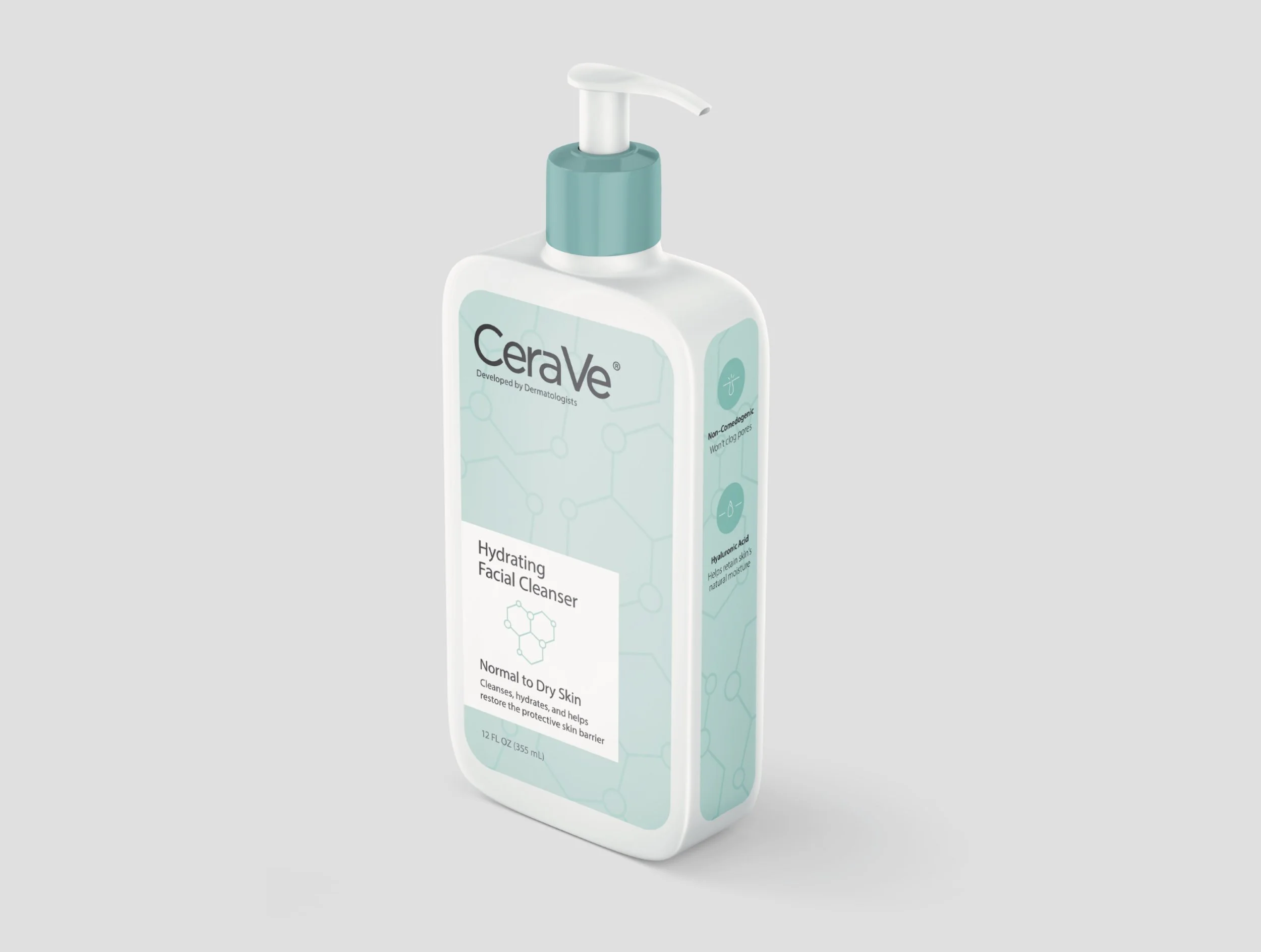
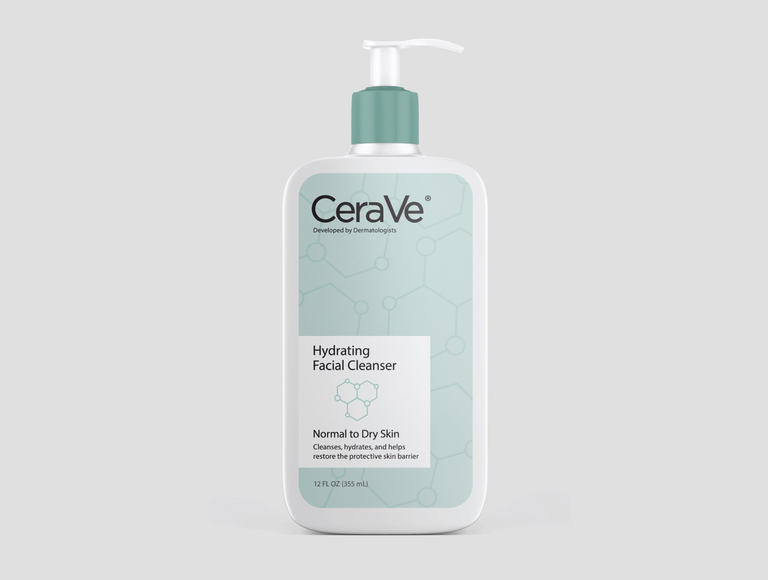
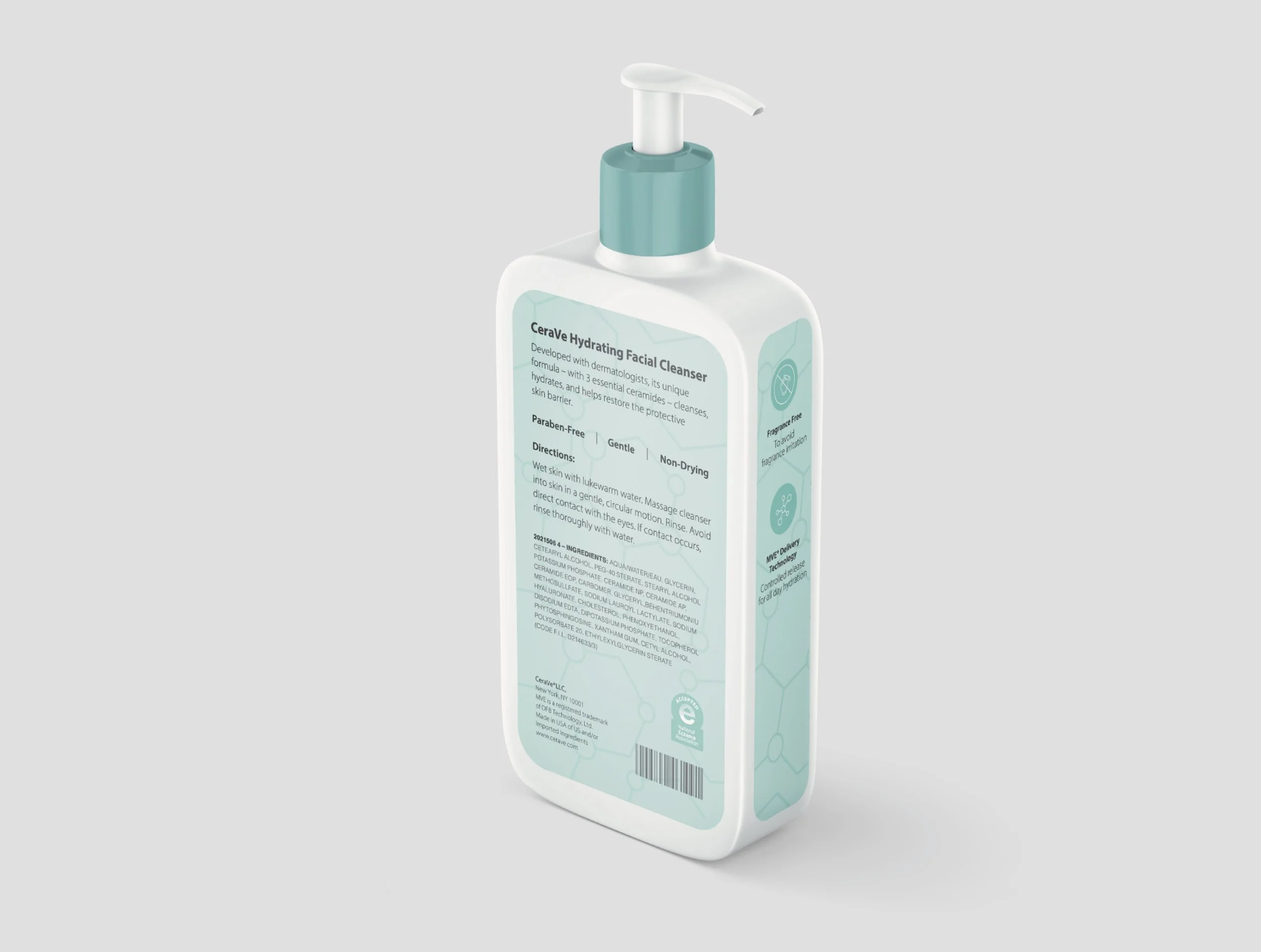
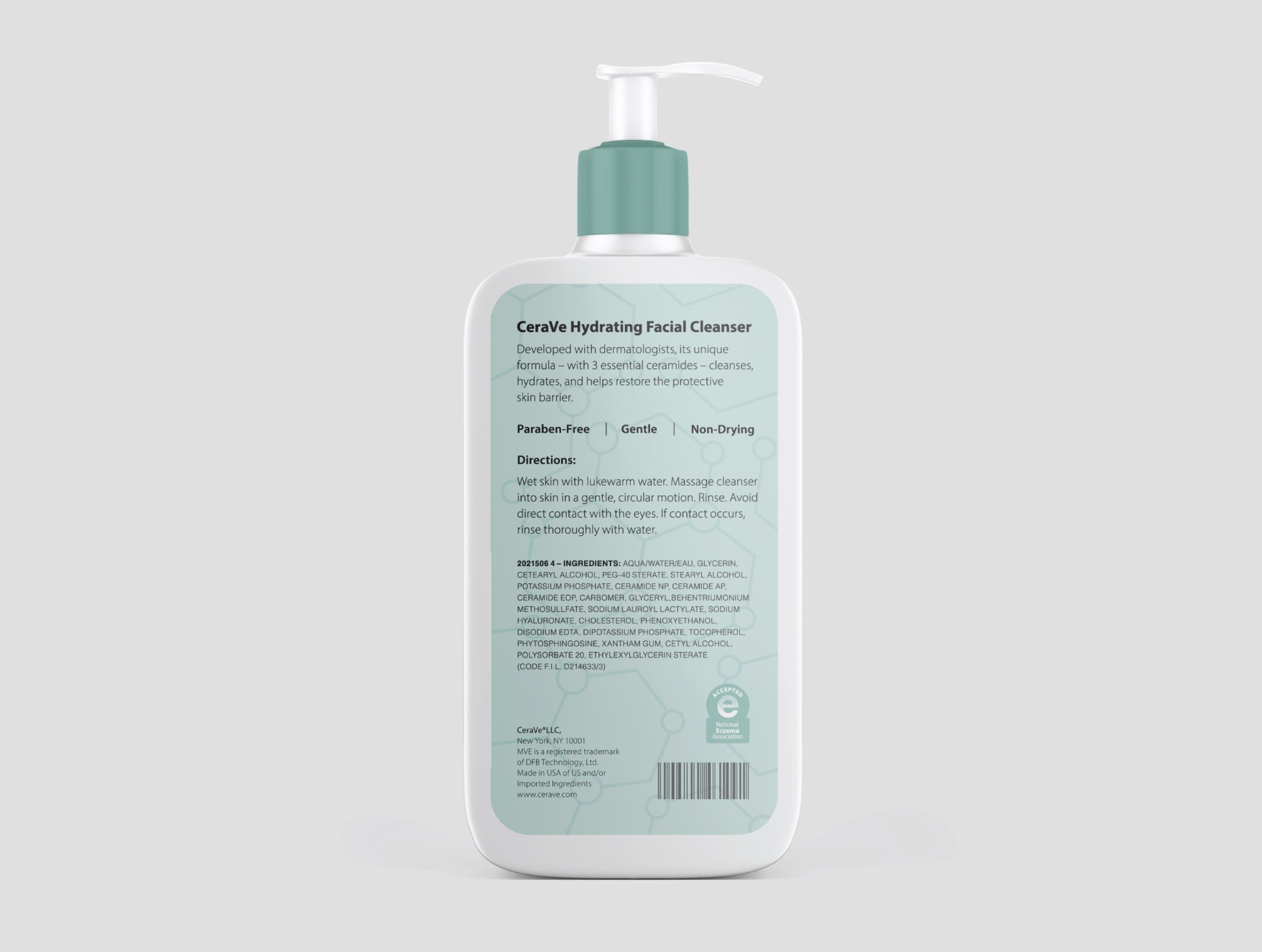
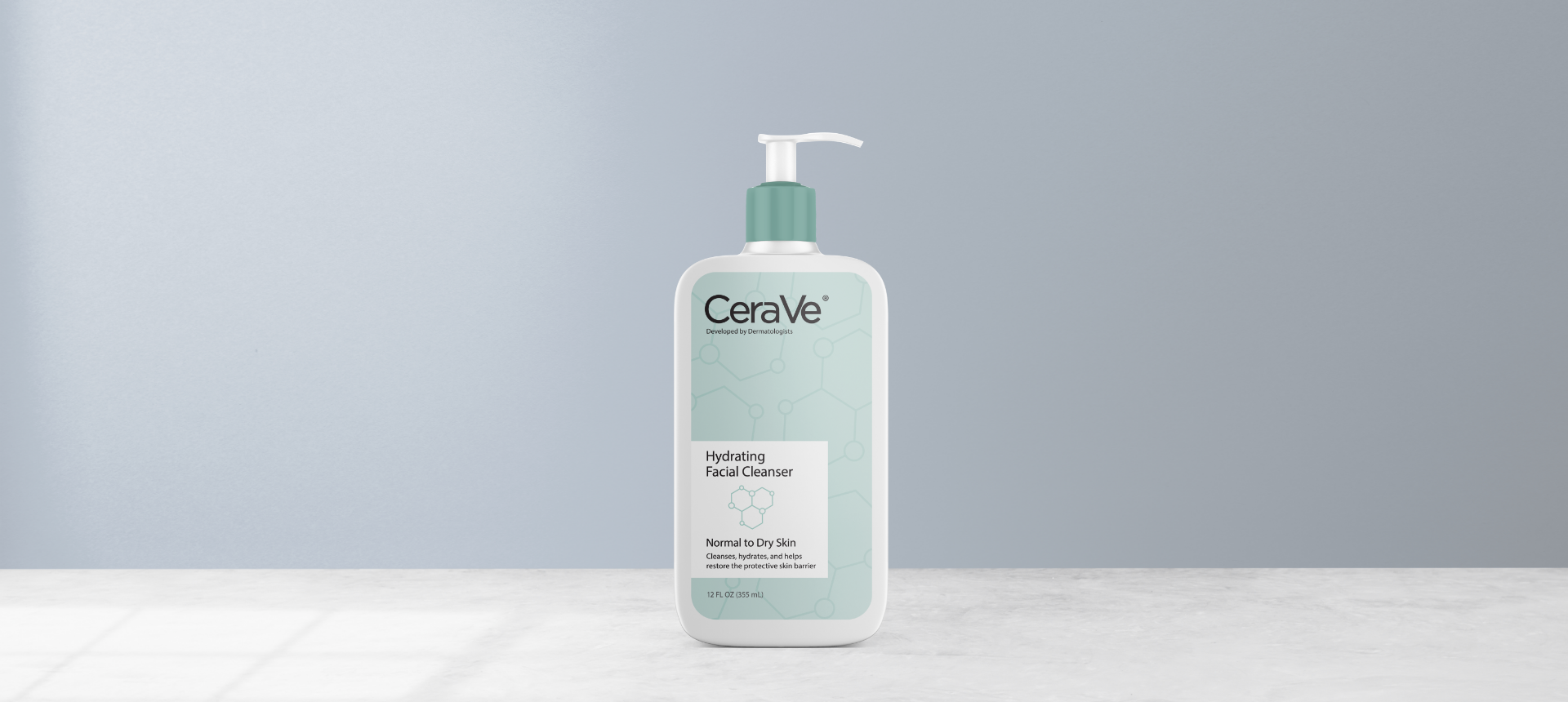
I redesigned CeraVe’s facial cleanser to reflect the brand’s focus on hydration and scientific credibility by shifting its green accents to a clean, light blue palette and introducing a subtle molecular pattern referencing the brand’s three essential ceramides. I also restructured the typography for clarity and consistency and developed a simple icon system to better organize product information and support a cohesive, trustworthy visual identity.